Some problems are simple enough for a “5 Whys” sprint. But what happens when a problem is a tangled mess of broken processes, bad data, human error, and market forces?
When a product launch flops, or a server outage brings down your platform, there isn’t one root cause. There are ten.
This is where the Fishbone Diagram (also known as the Ishikawa Diagram) shines. It’s the ultimate tool for visual thinkers and cross-functional teams who need to map out the chaos of a complex failure and find the signal in the noise.
What Is a Fishbone Diagram?
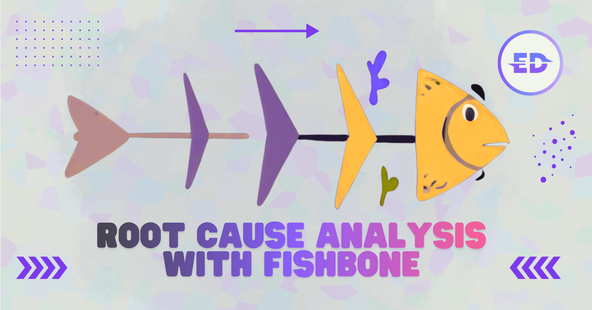
Created by Kaoru Ishikawa in the 1960s, the Fishbone Diagram is a visual root cause analysis tool that sorts potential causes into categories. It looks like a fish skeleton:
- The Head: The problem statement (effect).
- The Bones: key categories of causes (the 6 Ms).
- The Ribs: Specific contributing factors within each category.
Unlike a linear list, a Fishbone Diagram forces you to look laterally. It prevents “tunnel vision” where engineers blame code, sales blames leads, and support blames bugs. It puts everything on one canvas.
The 6 Ms Framework: A Taxonomy of Failure
To ensure you don’t miss anything, use the 6 Ms standard categories. While originally for manufacturing, they adapt perfectly to modern tech startups:
- Manpower (People): Skills, training, fatigue, communication, culture.
- Startup context: Did the team know how to do it? Was ownership clear?
- Method (Process): Standard operating procedures, handoffs, workflows, rules.
- Startup context: Was the playbook followed? Does a playbook even exist?
- Machine (Technology): Software, hardware, tools, integrations, servers.
- Startup context: Did the API fail? Was the laptop slow? Did the tool crash?
- Material (Data/Inputs): Raw data, specs, requirements, designs.
- Startup context: Were the design specs wrong? Was the customer data messy?
- Measurement (Metrics): KPI definitions, data accuracy, sensors.
- Startup context: Are we measuring the right thing? Was the dashboard broken?
- Mother Nature (Environment): Market conditions, competitors, regulations, remote work setting.
- Startup context: Did a competitor launch happen same day? Is the team burnt out from remote isolation?
Real-World Startup Example: “The Failed Feature Launch”
The Problem: The “Pro Analytics” dashboard launched, but only 2% of users adopted it (target was 20%).
Visualizing this on a Fishbone Diagram reveals a multi-factor failure:
| Category | Contributing Factors (The “Bones”) |
|---|---|
| People | • Sales team wasn’t trained on how to demo it • Product Manager went on leave during launch week |
| Method | • No in-app onboarding walkthrough • Marketing email sent to all users, not just admins |
| Technology | • Dashboard takes 12 seconds to load (too slow) • Mobile view is broken (unusable) |
| Data | • The sample data showed “0” for new users (looked broken) • Feature flags didn’t enable it for 30% of accounts |
| Measurement | • We tracked “clicks” but not “time spent” • Success metric was undefined for the beta group |
| Environment | • Launched during Thanksgiving week (low traffic) • Competitor released a free version 2 days prior |
The Result: Instead of blaming “Marketing” or “Engineering,” the team sees the holistic failure. The Fix:
- Engineering: Fix load time and mobile view (Sprint 1).
- Sales: Run a training workshop (Day 2).
- Product: Relaunch with sample data populated (Sprint 2).
How to Facilitate a Remote Fishbone Session
In 2026, you’re likely doing this over Zoom/Meet. Here’s how to run a killer session:
1. Prep the Board (Miro / FigJam)
Don’t draw it live. Have a template ready with the Head (Problem) and 6 Ms branches pre-filled.
2. Silent Brainstorming (10 Mins)
Give the team sticky notes. Ask them to write down potential causes. Rule: One cause per sticky. No discussion yet.
3. Sort and Cluster (15 Mins)
Drag the stickies to the corresponding “bones” (People, Method, etc.). Group duplicates. Magic moment: Watch as one category (e.g., “Method”) gets crowded. That’s your hotspot.
4. Vote on Root Causes (5 Mins)
Give each person 3 “dots” (votes). Ask: “Which of these, if fixed, would have prevented the problem?” Focus on the top 3 voted item.
5. Assign Actions
Don’t stop at the diagram. Assign an owner and a deadline for the top 3 fixes.
Tools of the Trade
| Tool | Best For | Why |
|---|---|---|
| Miro | Standard | Best library of pre-made Fishbone templates. |
| FigJam | Designers | Smooth drawing tools, great if you live in Figma. |
| Lucidchart | Formal | Better for strict diagramming and exporting to presentations. |
| Mural | Facilitators | Excellent privacy mode data-gathering features. |
Fishbone vs. 5 Whys: Which to Use?
| Feature | 5 Whys | Fishbone Diagram (Ishikawa) |
|---|---|---|
| Complexity | Simple, linear problems | Complex, multi-factor chaos |
| Time Needed | 15–30 minutes | 45–90 minutes |
| Participants | 2–3 people | 4–8 cross-functional team members |
| Output | A single root cause | A comprehensive map of failure modes |
| Best For | ”Why did the server crash?" | "Why is customer churn increasing?” |
Key Takeaways
The Fishbone Diagram turns the “blame game” into a “puzzle game.” It visualizes the complexity of startup problems and proves that failure is rarely one person’s fault—it’s usually a system of contributing factors waiting to be untangled.
Step 1: Draw the head (Problem). Step 2: Draw the spine and ribs (6 Ms). Step 3: Brainstorm, sort, and vote. Step 4: Fix the system, not the symptom.
FAQ
Why is it called a Fishbone Diagram? Because the visual shape resembles a fish skeleton. The head represents the problem (effect), the central spine connects the causes, and the angled branches (ribs) represent the categories of causes. It was created by Dr. Kaoru Ishikawa.
What are the 6 Ms in a Fishbone Diagram? The 6 Ms are standard categories to classify causes: Manpower (People), Method (Process), Machine (Technology), Material (Data/Inputs), Measurement (Metrics), and Mother Nature (Environment). Using these prompts ensures you don’t overlook a category.
Can I use different categories than the 6 Ms? Absolutely. For SaaS/Marketing, many teams use the 4 Ps (Product, Price, Place, Promotion) or 4 Ss (Surroundings, Suppliers, Systems, Skills). The categories are just prompts to help you think laterally—adapt them to your context.
How is a Fishbone Diagram different from a Mind Map? A Mind Map is for expansive, free-flowing ideation (radiating out from a center). A Fishbone Diagram is structured specifically for convergence toward a root cause (pointing in toward the problem). It’s an analytical tool, not just a creative one.
Is Fishbone Analysis suitable for small problems? Usually, no. It’s overkill for simple issues where the 5 Whys would work in 5 minutes. Save the Fishbone for complex, hairy problems like “Quarterly revenue missed by 30%” or “Product quality score dropped significantly.”
Can I do a Fishbone Diagram alone? You can, but it defeats the purpose. The power of the Fishbone comes from diverse perspectives. A engineer will see “Machine” causes, a PM will see “Method” causes, and a Sales rep will see “People” causes. You need the whole picture.